
User Flows & Checklist
May 22, 2025

Good information architecture is invisible. Users find what they need without stopping to think about where it lives. The moment someone hesitates or wonders where to go next, the structure has already failed.
I’ve seen many navigation systems built around internal org charts instead of user mental models. Marketing needs visibility. Product wants priority. Legal requires placement. The result is a navigation that reflects internal politics rather than how people actually think.
My approach focuses on designing structure based on real user behavior. Through card sorting, task analysis, and iterative testing, I uncover how users naturally group information and complete tasks. From there, I design navigation systems that remain clear as products grow, especially in complex, remote-first environments where misalignment compounds quickly.
What IA Work Actually Produces
Information architecture isn’t abstract theory. It produces concrete artifacts that teams rely on to build and scale products with confidence.
Sitemaps provide a clear view of content structure and relationships. They go beyond simple hierarchies to show how users move between sections and how content connects across the product.
Navigation systems are designed in layers. Primary navigation handles major sections and stays visible. Secondary navigation supports contextual exploration. Utility navigation covers functions like search, account settings, and system-level actions. Each layer has a purpose. When those roles blur, users lose orientation.
Taxonomy defines how content is categorized and labeled. Good taxonomy uses language users already understand. Poor taxonomy forces guessing and increases cognitive load.
Content inventories catalog existing pages, assets, and metadata. This step exposes redundancy, gaps, and outdated content. You can’t design a scalable structure without knowing what already exists.
Mapping How Users Actually Move
Task flows document the most direct paths for specific goals. Resetting a password or completing a purchase should follow a clear, predictable route. Mapping these flows exposes unnecessary steps and friction.
User flows expand on this by showing branching paths, decision points, and alternate routes. Real users don’t follow ideal paths. They backtrack, skip steps, and explore. Designing for this reality prevents breakdowns later.
Wireflows combine interface and logic into a single artifact. Seeing screens and transitions together makes reviews faster and helps developers understand both intent and behavior.
Error flows define how users recover from mistakes. Wrong inputs, dead ends, and system failures are inevitable. Designing recovery paths upfront prevents frustration and support issues after launch.
Research That Reveals Mental Models
Card sorting uncovers how users naturally group information. Open sorts reveal organic categorization. Closed sorts validate proposed structures. Hybrid approaches help confirm decisions. I use these methods early to avoid designing based on assumptions.
Tree testing validates navigation independently of visual design. Users attempt to find content using only the hierarchy. If they can’t locate it here, visual polish won’t fix the problem. This keeps structure grounded in findability, not aesthetics.
Choosing Navigation Patterns With Intent
Different products require different navigation patterns. Global navigation supports primary sections across the product. Local navigation provides context within sections. Utility navigation handles system-level functions users expect but don’t need constantly.
Breadcrumbs support deep hierarchies by providing orientation. Mega menus work well for content-heavy platforms where browsing matters. Hub-and-spoke patterns suit mobile apps with focused tasks and shallow depth.
Using the wrong pattern creates friction. Overpowered navigation overwhelms simple products. Underpowered navigation hides complexity users need to understand. Structure should respond to content and behavior, not templates.
From Chaos to Clarity
My process begins with a content audit. Every page, file, and asset is inventoried. Relationships are mapped. Redundancies and gaps are identified. Structure can’t be improved without visibility.
User research follows. Card sorting reveals grouping logic. Task analysis shows what users are trying to accomplish. Mental model interviews expose how users think about the problem space. This isn’t about preferences. It’s about behavior.
Structure design turns insight into scaffolding. I develop sitemaps, navigation systems, and taxonomy aligned with user language and expectations. This is where research becomes architecture.
Validation ensures the structure works before development. Tree testing, first-click testing, and prototype navigation testing catch issues early. Fixing IA before build saves significant time and cost.
Documentation makes the system usable for teams. Flow diagrams, navigation specifications, and content models remove ambiguity for developers and content teams. Clear documentation is especially critical in remote environments where assumptions don’t get corrected casually.
Flow Documentation Standards
Pattern | Best For |
|---|---|
Global Navigation | Primary sections, always visible |
Local Navigation | Sub-sections, contextual |
Utility Navigation | Account, search, settings |
Breadcrumbs | Deep hierarchies, orientation |
Mega Menus | Large content sites, browsing |
Hub & Spoke | Mobile apps, focused tasks |
Tools That Support Clarity
I use Figma and Whimsical for flow and IA work. Whimsical allows rapid exploration early on. Figma supports detailed wireflows, navigation specs, and interactive testing.
Prototyping stays in Figma so navigation, interaction, and validation happen in one place. Fewer tools mean less friction and faster iteration.
Documentation is intentionally lightweight. If diagrams and notes aren’t understandable at a glance, they won’t be used. Clarity matters more than volume.
Where IA Is Headed
AI-driven search is changing how users access information. When users can ask questions directly, IA becomes less about entry points and more about content relationships and structure integrity.
Personalization is also reshaping navigation. Static structures assume identical needs. Adaptive navigation responds to behavior and role, reducing cognitive load when implemented thoughtfully.
Another shift is toward modular, componentized content. Page-based IA is giving way to systems where content assembles dynamically. Designing metadata and relationships that allow flexibility without chaos is becoming increasingly important.
Why IA Projects Fail
IA fails when teams rely on internal assumptions instead of research. It fails when structures don’t account for growth. What works for fifty pages often collapses at five hundred.
Over-engineering is another common failure. Complex taxonomies and deep hierarchies confuse users when simple structures would suffice. Structure should serve clarity, not ambition.
How I Measure Success
I don’t measure IA success by how polished a sitemap looks. I measure it by outcomes.
Can users find what they need quickly?
Do labels make sense without explanation?
Do users move confidently instead of hesitating?
Analytics reveal confusion through excessive backtracking, overuse of search, or repeated support requests. When IA works, it disappears. Users don’t notice it because nothing gets in their way.
That’s the goal: structure so clear it becomes invisible.
Case Study
Inspo: 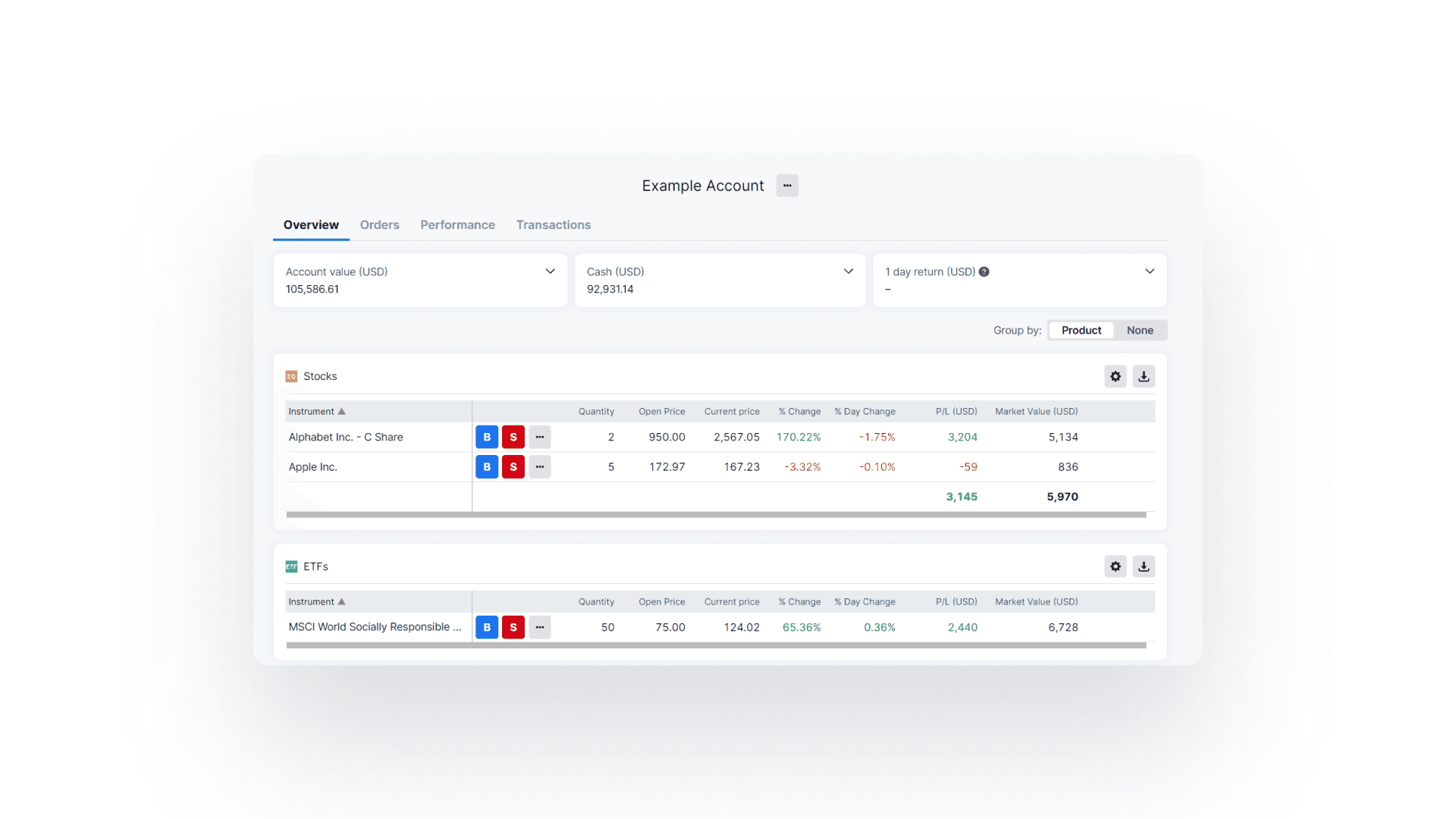 | Handover: 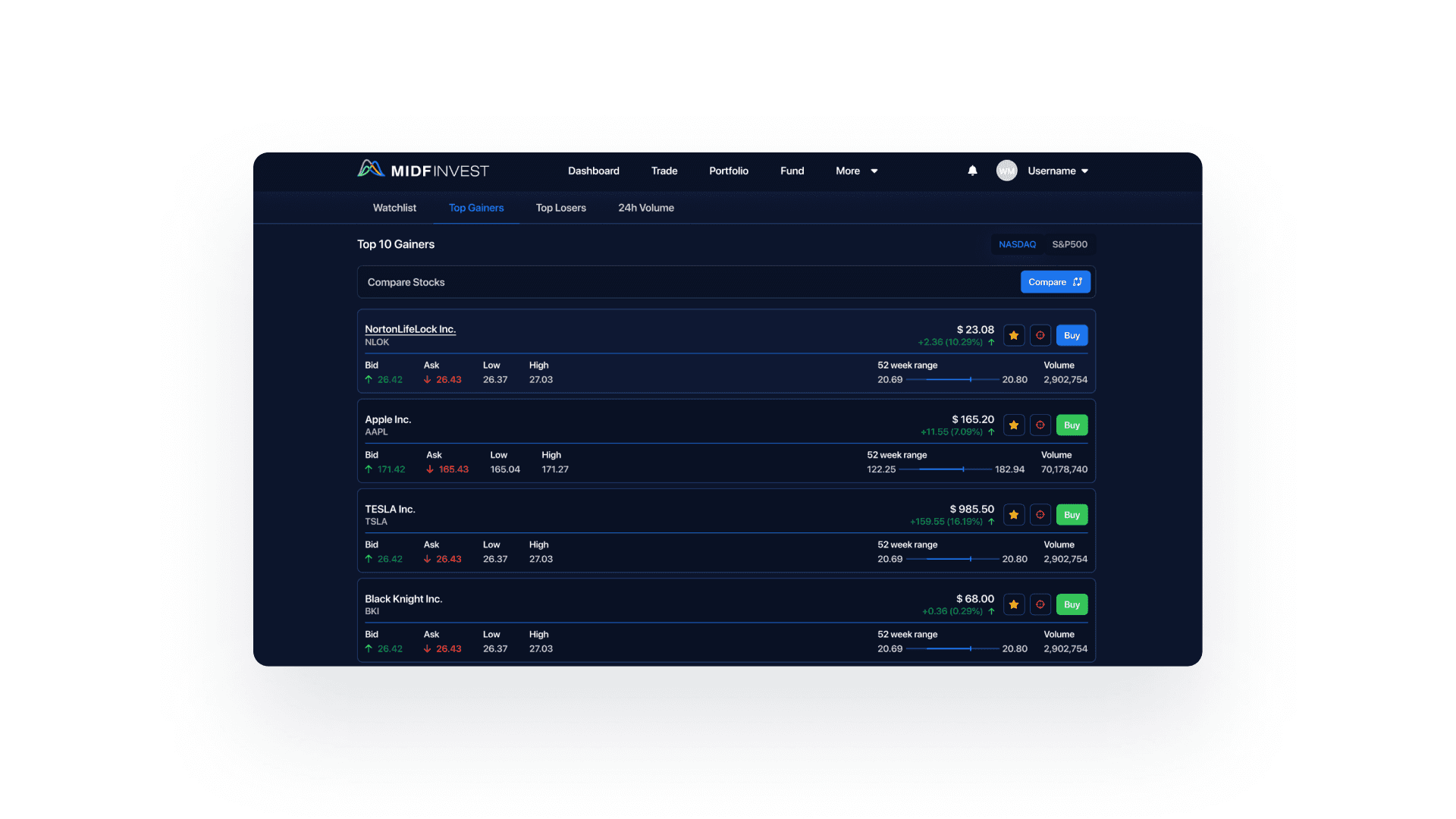 |
|---|
Challenge: MIDF Invest My dashboard had grown organically over 3 years, resulting in a navigation system with 47 top-level items and users reporting they "can't find anything."
Approach: Conducted content inventory (312 unique pages), open card sort with 24 users, and tree testing on proposed structure. Redesigned IA to 7 primary categories with logical sub-groupings.
Outcome:
Task completion time reduced by 35%
Navigation satisfaction score increased from 2.1 to 4.2 (out of 5)
Support tickets for "where do I find X" decreased by 60%
OTHER WORKS


