
Design System
Jan 19, 2026

Early in my career, I learned a simple truth: strong frameworks aren’t optional. They’re often the difference between shipping on time and explaining why you didn’t.
Working in a software house environment taught me that speed equals survival. Clients rarely remember how elegant your process was. They remember whether you delivered when you said you would. That lesson has stayed with me as I moved into product and platform design, especially in remote and distributed teams where alignment is harder and mistakes scale faster.
Tools have evolved quickly, from Adobe XD to Figma, and now AI-assisted workflows with tools like Cursor. Each shift promised faster delivery and better quality. But one thing hasn’t changed. As Jeff Bezos puts it, customers consistently want fast delivery, convenience, lower friction, and reliable outcomes. Design systems exist to support exactly that, especially when teams are distributed and moving quickly.
The Real Challenge: Keeping Design and Code Aligned
Design systems help teams ship faster and more consistently, but most fail at the same point: keeping design and engineering aligned as the product grows.
The moment design is handed off, quality starts to drift. Components evolve. Edge cases appear. New patterns get introduced under pressure. Without clear governance and shared standards, the system fragments and teams lose trust in it.
The real challenge isn’t just building components. It’s ensuring what ships matches what was designed, tracking what’s actually used in production, and keeping the system healthy as more people contribute across locations and time zones.
How I Structure Scalable Systems
I design systems in layers, with each layer reinforcing the next. Nothing exists in isolation.
Design tokens form the foundation. Color, typography, spacing, and elevation are treated as shared contracts between design and code. When tokens are structured correctly, a single change can cascade safely across the product. This is where leverage comes from.
On top of tokens, I build core components using atomic design principles. States, variants, and responsive behaviors are defined before development begins. Components scale into patterns and templates, each referencing the layer below to avoid duplication and drift.
Documentation runs alongside the system, not after it. Usage guidelines explain the reasoning behind decisions. Handoff specs reduce ambiguity for developers. Example implementations show how components work in real contexts. Accessibility is built into components from the start, with WCAG considerations treated as baseline requirements, not optional enhancements.
Governance: What Keeps Systems Alive
A design system without governance quickly becomes a static Figma file. I’ve seen teams launch with enthusiasm, only to watch standards erode as deadlines pile up.
That’s why governance is part of the system from day one. I establish clear contribution workflows so team members know how to propose changes, introduce new components, or flag issues. Every addition is reviewed against reuse potential, token alignment, and real product needs.
Changes are documented and communicated clearly. Teams understand what changed, why it changed, and how to adapt. Adoption is tracked so decisions are based on real usage, not assumptions. This is especially critical in remote teams, where visibility is limited and alignment depends on shared systems rather than hallway conversations.
My Process: From Audit to Adoption
I usually begin with a UI audit to understand the current state of the product. Screenshots are reviewed, patterns are identified, and inconsistencies are documented. From there, I rationalize color palettes, typography scales, and spacing systems, turning them into structured tokens that act as a single source of truth.
Next comes component design. States, variants, and responsive behaviors are mapped carefully to ensure components work across use cases and platforms. Documentation is created alongside the design to support clear handoff and reduce back-and-forth.
Finally, governance is implemented. Contribution workflows, review processes, and update communication ensure the system continues to evolve without losing consistency. Shipping components isn’t the end of the process. It’s the beginning.
Tools, AI, and Where I’m Headed
Figma is the core of my workflow, using Variables, Component Properties, and Auto Layout to manage complexity. Tokens are exported using tools like Style Dictionary and Figma Tokens so design and code pull from the same source of truth.
I’m actively exploring emerging workflows like Figma MCP, which makes design systems queryable by AI tools. Instead of searching documentation, teams could ask AI assistants questions and receive precise answers backed by live system data. Design systems become infrastructure, not just reference material.
I’m also studying how Figma Code Connect links components directly to production code. This closes a gap I’ve seen repeatedly between what’s designed and what ships. I’m looking for opportunities to implement this in teams with mature systems and strong design–engineering collaboration.
Another area of interest is automated usage tracking. Monitoring which repositories consume the system, tracking version adoption, and understanding real component usage can fundamentally improve governance decisions. I haven’t deployed this yet, but I’m actively researching implementation paths and welcome projects where adoption data is part of the system strategy.
Why This Matters Now
Design systems are no longer static libraries. They’re becoming living ecosystems that connect design, code, and increasingly AI-assisted workflows. Teams that succeed are the ones that treat systems as infrastructure, not documentation.
The goal isn’t just consistency. It’s making it easier to ship the right thing, faster, without sacrificing quality, even as teams grow and work remotely.
That’s what I focus on building: systems that reduce friction so shipping becomes the easiest part of the job.
AI-assisted tools like Cursor accelerate prototyping, but they’re only effective when given structured context. Feeding them design system data allows AI to generate code that already follows established patterns. This doesn’t replace engineers. It helps them move faster with fewer mistakes.
Case Study
Before 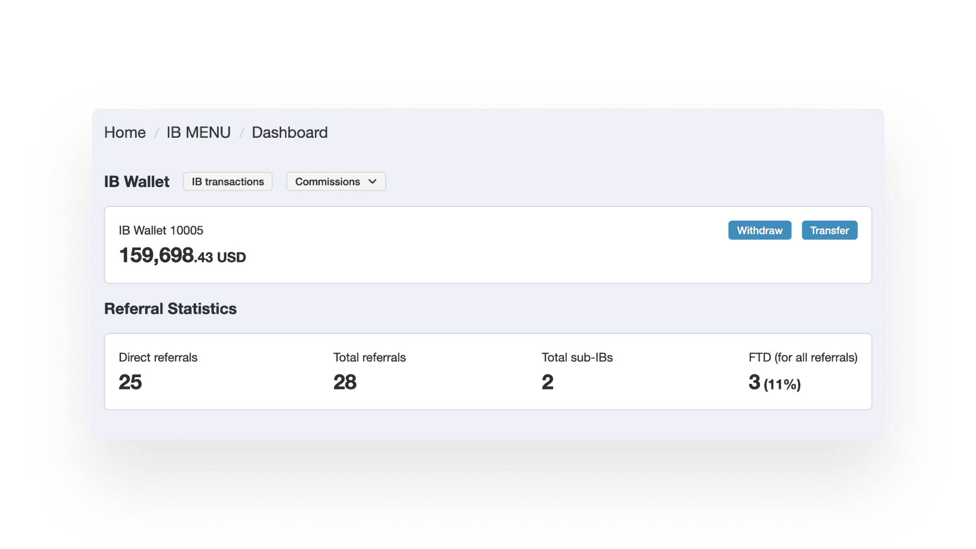 | After 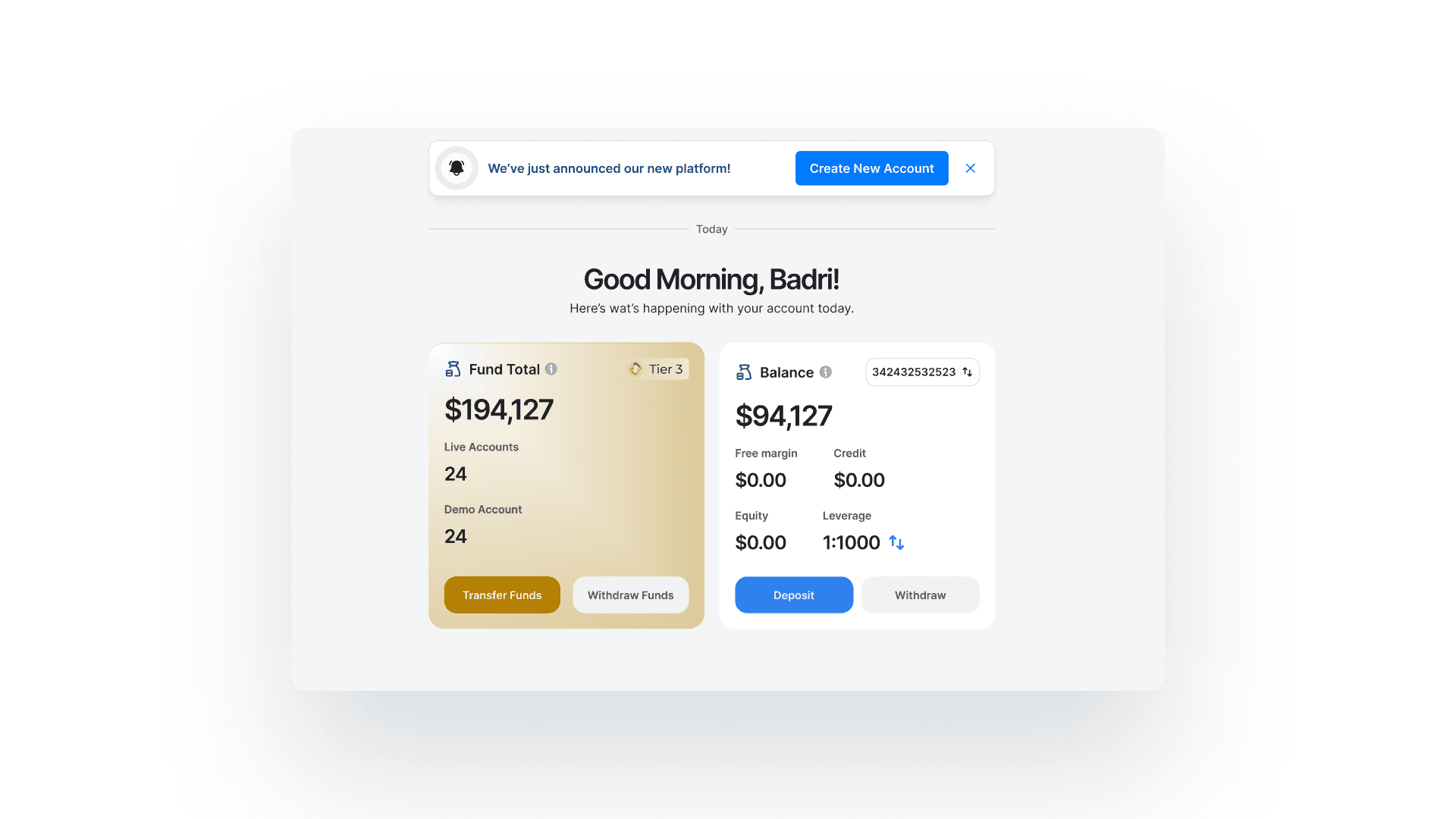 |
|---|
Challenge: Loyal Primus had 2 different button styles across their product, inconsistent spacing, and designers spending 30% of time recreating components.
Approach: Conducted UI audit identifying 47 unique component variations that could be consolidated to 12 core components. Established token system and component library with comprehensive documentation.
Outcome:
40% reduction in design time for new features
60% faster developer implementation
Zero brand inconsistency complaints from stakeholders
OTHER WORKS


